My book on Building Dashboards with Dynamics GP 2013 and Excel 2013 is great resource if you’re looking to get rolling with dashboards and GP. However, if you need something to show off tomorrow, Business Analyzer for GP has a fun dashboard mode.
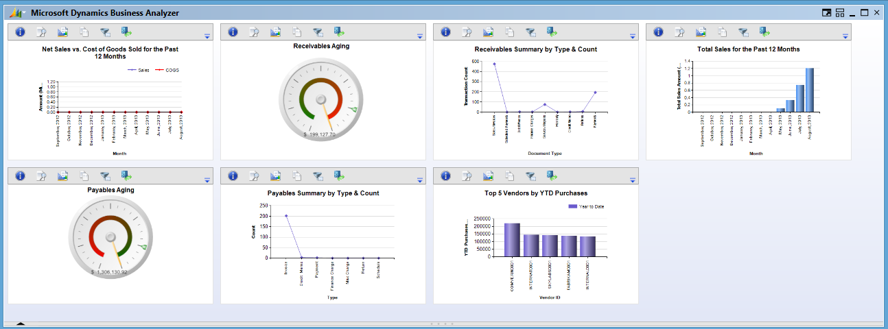
Business Analyzer runs on SQL Server Reporting Services and can use all of the prebuilt reports and KPI”s that ship with Dynamics GP. It’s included with GP 2010 and 2013. By default, Business Analyzer shows one big report at a time. It doesn’t feel like a dashboard, it feels like PowerPoint. But there is a dashboard mode that’s a little better. I’m assuming that you have or can get SSRS and Business Analyzer running with the included SSRS reports. The process is pretty straightforward and it’s easy to build a dashboard that looks like this:
To build a dashboard in Business Analyzer:
- Fire up Business Analyzer
- In the upper left corner pick the drop down menu attached to the Dynamics logo.
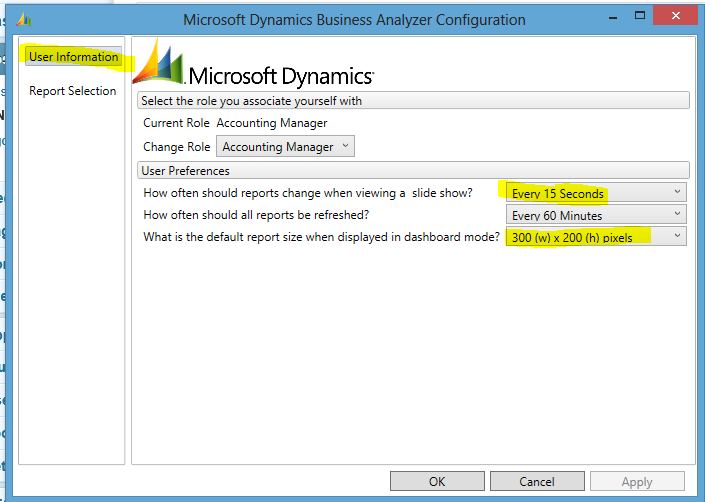
- Pick the User Information tab on the left.
- Under User Preferences set How often should reports change when viewing a slide show? to Every 15 seconds
- Also under User Preference, set What is the default report size when displayed in dashboard mode to 300 (w) x 200 (h) pixels . This is the highest setting.
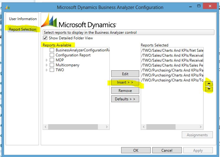
- Pick the Report Selection tab on the left
- Add/Remove the appropriate reports, charts and KPI’s. If you are just using the defaults, you may have to pick more than what you need at first to figure out the right ones.
- Use the arrow keys to order the reports and click OK to finish.
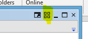
- One you have your Business Analyzer screen back with a big report in the middle, click the icon in the upper right that has four (4) boxes. This toggles between Dashboard mode and Split mode. In Split mode it shows four boxes and in Dashboard mode it shows a big box with two little ones below.
In Dashboard mode, you get big thumbnails of your reports, enough to see at a glance if something is green or red or trending up or down. If something needs more attention you can switch to Split mode for a better look.
We set the setting for the slide show earlier to 15 seconds. This isn’t strictly necessary, but if you hit the slanted up arrow icon for a full screen slide show it will cycle through the reports every fifteen seconds. That’s way more than enough to figure out if you need to stop and look deeper and provides another option for reviewing the reports.
Since these are SSRS reports, it’s pretty easy to build a report that looks at just one thing, AR, AP, Cash position, etc. if the building in options don’t do it for you. Business Analyzer provides a way to bring these together into a dashboard like setting.